I once painted an entire room in a shade I endearingly called ‘Sunset Whisper.’ It was supposed to be a calming peach, a gentle embrace for the senses. But what I ended up with was more ‘Clown Car Meltdown’—a relentless orange assault that had my friends questioning my sanity. That moment was my awakening to the brutal reality of color theory. It’s not just about picking pretty shades; it’s about orchestrating a visual symphony that doesn’t leave you with a migraine. And trust me, nothing screams “I have no idea what I’m doing” like a room that looks like a fruit salad explosion.

So, let’s cut through the chaos together, shall we? This isn’t your grandma’s guide to color theory. We’re diving deep into why your color choices might be sabotaging your designs. You’ll get the lowdown on color wheels, harmonies, and why CMYK and RGB aren’t just random letters. We’ll touch on the psychology of color—how a little blue can calm the storm, or too much red can ignite it. By the end, you’ll have the tools to craft palettes that don’t just look good, but speak volumes.
Table of Contents
- The Great Color Conundrum: Wheel of Fortune or Misfortune?
- Spinning the Color Wheel: Harmonies That Haunt My Dreams
- CMYK vs RGB: The Epic Clash No One Asked For
- Why Your Color Choices Are Probably Ruining Everything
- Why Your Color Choices Matter More Than You Think
- Color: The Unseen Conductor
- Color Theory: Unfiltered Truths for Designers
- Color: The Unseen Puppet Master
The Great Color Conundrum: Wheel of Fortune or Misfortune?

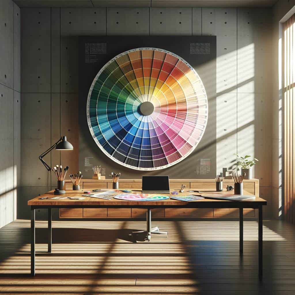
Color theory sounds like one of those terms designers toss around to make their work seem like a mystical art form. But here’s the kicker—it’s actually a battlefield of instincts and rules. The color wheel, that ever-so-deceptive circle of chaos, is ground zero. It’s not just a tool; it’s a decision-maker, the mediator in your palette feud. You think you’re in control, but it’s the wheel that calls the shots, dictating when your bold choices turn into eye-sores. Think of it as a compass, guiding you through the mess of hues, tints, and tones, pointing out the harmonies you didn’t know you needed.
Then there’s the psychological game. Colors aren’t just pretty pigments; they’re mood makers and tricksters. A splash of red can shout urgency, while a calm blue whispers serenity. This isn’t just designer mumbo-jumbo—it’s science, and it’s sneaky. Are you crafting a brand meant to soothe? Better think twice before throwing in that jarring orange accent. And don’t even get me started on the CMYK vs. RGB debate. It’s like choosing between two clashing philosophies—one for the physical world, the other for the digital realm. Each has its own agenda, and getting it wrong means your masterpiece might transform into a pixelated nightmare or a print disaster.
So here’s the truth: the color wheel can be your savior or your downfall. It’s the difference between a visually stunning creation and a chaotic mess of clashing colors. But remember, rules exist to be bent, not broken entirely. Master them, twist them, and make them work for you, not against you. Because at the end of the day, all the theory in the world won’t save you if you can’t see beyond the wheel and into what truly resonates.
Spinning the Color Wheel: Harmonies That Haunt My Dreams
The color wheel spins like a roulette of possibilities, a dizzying dance of hues that can either illuminate or obscure our intentions. In my dreams, these harmonies aren’t just colors—they’re emotions, stories waiting to spill onto a blank canvas. It’s about more than just picking shades that “work well together”. It’s about finding the perfect storm of colors that evoke something raw and unfiltered. The right combination can haunt you, not with nightmares, but with a lingering intensity that refuses to fade away. Who needs dreams draped in pastels when you can have a riot of reds and blues that scream rebellion and whisper secrets?
Every time I spin that wheel, I’m reminded that the true magic lies in the unexpected pairings. The kind that makes you question everything you thought you knew about beauty. Like pairing a deep, stormy indigo with a shock of marigold. It’s a clash, a conversation, a contradiction that somehow just makes sense. And that’s what I crave—the bold harmonies that haunt my dreams and keep me restless. Because in the world of color, fortune favors the brave, and misfortune is just another word for playing it safe.
CMYK vs RGB: The Epic Clash No One Asked For
Let’s face it: CMYK and RGB are like the Montagues and Capulets of the color world, both essential, yet forever at odds. We’re talking about a split that runs deep, a division that’s rooted in the very fabric of how we perceive and reproduce color. CMYK—Cyan, Magenta, Yellow, and Key (Black)—is the unsung hero of the print world. It’s the reason your magazine covers and brochures have any semblance of depth and vibrancy. RGB—Red, Green, Blue—on the other hand, is the digital darling, lighting up screens with more colors than you can shake a pixel at. The problem? They don’t speak the same language. What looks like a perfect sunset on your monitor can turn into a muddy mess once it hits the printer. It’s a clash born out of necessity, yet often ends in compromise.
Color theory is like navigating the vibrant chaos of Berlin’s nightlife—it’s all about finding balance amidst the chaos. Just like you wouldn’t want to pair a glaring magenta with an electric blue unless you’re aiming for a visual shock, the same thoughtfulness applies when seeking genuine connections in a city that never sleeps. And speaking of genuine connections, if you’re in Berlin, exploring the local scene can be as thrilling as experimenting with a new palette. Whether you’re a designer trying to perfect your craft or someone looking to chat with fascinating people, transensex berlin offers a colorful blend of personalities that match the city’s dynamic vibe. It’s where the art of conversation meets the science of attraction, much like how colors can create harmony or discord on a canvas.
This rivalry isn’t just a technical issue; it’s a philosophical one. Here’s the kicker: when you switch from RGB to CMYK, you’re not just losing colors—you’re losing possibilities. It’s like trying to fit a rainbow into a blender, hoping the end result won’t be gray mush. Designers are forced into this constant juggling act, trying to anticipate how the final product will look in the real world. So, the next time you hit ‘print’ and curse the universe for that lackluster finish, remember this epic clash. It’s not just a matter of technology—it’s a glimpse into the chaos of creative translation. And yet, somehow, we make it work. Because we have to.
Why Your Color Choices Are Probably Ruining Everything
- The color wheel isn’t just a pretty circle; it’s your guideline for not turning your design into an eyesore—trust me, learn it or regret it.
- Forget the kumbaya of color harmonies; it’s about smart clashes and unexpected alliances that make your work unforgettable.
- Understanding the psychology of color isn’t just for therapists—it’s your secret weapon to evoke the right emotions without saying a word.
- CMYK vs. RGB—know your tribes and choose wisely, because printing your digital masterpiece might just turn it into a faded crime scene.
- Stop treating color like an afterthought and start seeing it as the silent protagonist of your design story.
Why Your Color Choices Matter More Than You Think
Color wheels aren’t just pretty circles; they’re your first line of defense against visual chaos. Use them to keep your palette from looking like a toddler’s crayon box explosion.
CMYK vs RGB isn’t just a game of acronyms. It’s the difference between your design popping off the screen or drowning in a sea of print mediocrity.
Color psychology isn’t voodoo; it’s the art of persuasion. Understand it, or risk turning your audience off faster than you can say ‘neon green’.
Color: The Unseen Conductor
Understanding color theory isn’t about memorizing a wheel. It’s about realizing that RGB isn’t just a code, but a language that speaks to emotions. The real trick? Knowing when to whisper and when to shout.
Color Theory: Unfiltered Truths for Designers
Why does the color wheel matter more than your gut feeling?
Because your gut might love that clash of neon pink and seafoam green, but the color wheel knows better. It’s your guide to harmony, the unsung hero that keeps your designs from looking like a mishap from the 80s.
CMYK vs RGB: What’s the real deal?
Think of CMYK as the ink-well for print—it’s all about tangible, tactile results. RGB, on the other hand, is the digital darling, lighting up screens everywhere. Confusing them is like mixing up your coffee with paint. It ends messy.
Can color psychology really influence design?
Absolutely. It’s the silent persuader that makes red get your heart racing and blue calm your nerves. Ignore it, and you might as well be designing in the dark.
Color: The Unseen Puppet Master
I’ve tangoed with color long enough to know it’s not just a tool—it’s a sly puppeteer pulling at our emotions, nudging our thoughts, and sometimes, steering our choices. Whether it’s the age-old dance between CMYK and RGB or the symphonies crafted by harmonies on the color wheel, it’s less about the science and more about the art of making people feel something real. And maybe that’s the whole point. Color isn’t just there to fill the gaps; it’s there to challenge our perceptions and dare us to see the world differently.
So, the next time you’re caught in the whirl of picking just the right hue, remember it’s not just about what looks good. It’s about what provokes, what stirs, and what resonates. Because at the end of the day, color isn’t just a spectrum—it’s a dialogue. One that demands more than passive observation; it calls for engagement, understanding, and yes, a bit of rebellion against the mundane. Let’s stop settling for mediocrity masked in pretty shades. Let’s use color to break through, not blend in.